UX Design with Myspace VP of UX, Mike Macadaan
02-Dec-10 13:26

1-Dec-2010 - a half-day workshop hosted at Bootup, with Mike Macadaan, VP of UX at Myspace.
The stage was set with a little history on how Myspace went from being super hot to where it was popular but losing its edge and a bit uncool. Myspace also seemed to be competing directly with Facebook et al. The future was looking pretty grim...
A walk-through the revamp process, ending up with a look at the new Myspace. For the last hour, in groups of ~6, we came up with a UX project and quickly went through the basic steps.Myspace reborn
The goal was to be done in months, not years. Mike also knew that a happy team will create high quality results. First he wangled a private but local physical space for his revamp team - minimize distractions, maximize access to resources. He was positive the designers he had the talent, so he split it into two teams - a team to support the existing Myspace, and the secluded team for the revamp.Since time was critical and budget was not really an issue, he felt it was wise to push the challenge out to about four hot design agencies around the world, including Champagne Valentine and Resn to get ideas flowing in. In retrospect he feels he would have succeeded without, but it would have been hire wire without a net.Who is it for?
The team defined the target as social entertainment for 13-35yr olds, but they defined the prototypical user as a 21yr old (cos all 13yr olds want to be 21, and all 35 yr olds yearn for it too). From here they developed three user personas: general consumer, curator and creator. For example, the general consumer persona was named Britney Butterfly, and she flits about, is concerned with her image, has lots of friends, and needs to present different views of herself (one for close friends, another for her family etc.).Clarity and process
Next the team figured out what was not solved, created a list sorted by guiding principles of the project. Brainstorming new and interesting ways to solve the problems came next, followed by narrowing to the best ideas, which could then be assembled into a notional product. From this a prototype was built. Mike stressed the importance of now revisiting the brainstorming to figure out where you may have weaknesses.
- Mood boards / Visual Design
- Information architecture - the old one had grown organically and was quite scary
- Logo
- Research and validation
The above process led to this: it’s about self-expression, “a place to be free”; they are “21yrs old”; they are about being different, experimental, constantly looking for new and interesting ways to produce cool things so they can express how different they are; they want multiple personas, even if they are totally fake, cos not everyone they want to connect with needs to see the same person or even the real person.So Myspace must
- make me feel completely inspired and adventurous, on a fast-paced real-world hunt!
- be an 24/7 environment - alive, exclusive, hip, different, boundless, integrating whatever from wherever...
- enable identities that are about being different
- tell me what others think about me - I want recognition and reward in a way that makes me feel awesome
- give me new ways to share my passions and collaborate
To sell the new Myspace internally, a short video was created, which we got to see - it showed the three personas as live people, and the design thinking, leading up to seeing the new myspace in action, and was summarized by this:
“The new myspace is the leading entertainment destination that is socially powered by the passion of fans and curators.”
The big changes are: new segment “curators”; focus on Gen Y; focus on entertainment; mobile and offline experience; working with vs. fighting other social sites like Facebook; and of course the logo...

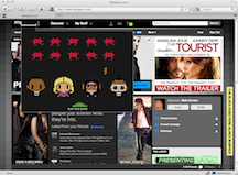
They have lots of fun with this, with random animations activated with a mouse hover - right now it’s a playable space invaders game.
 Workshop
The workshop was a seriously compressed version of a two-day event, but we were all delighted how in just one hour we could cover so much ground.Our team tackled the problem of finding a simple way for different families to pool their photos from shared events.
Tools used by the revamp team
- Balsamiq Mockups - rapid wire-framing
- Basecamp - project management
- Wordpress - blog
- a physical gallery
- Glue - an internal tool for Myspace design standards and patterns
blog comments powered by Disqus


